Structured list
Color
| Class | Property | Color token |
|---|---|---|
.bx--structured-list-th | text color | $text-01 |
.bx--structured-list-td | text color | $text-02 |
.bx--structured-list-row--header-row | border-bottom | $ui-03 |
.bx--structured-list-row | border-bottom | $ui-03 |
Interactive states
| Class | Property | Color token |
|---|---|---|
.bx--structured-list-row--selected | background-color | $selected-ui |
.bx--structured-list-svg:checked | fill | $ui-05 |
.bx--structured-list-row:hover | background-color | $hover-row |
.bx--structured-list-svg:hover | fill | $ui-04 |
.bx--structured-list-row:focus | border | $focus |
Typography
Structured list headers should be set in title case, while all other text is set in sentence case. All typography is left aligned.
| Property | Font-size (px/rem) | Font-weight | Type token |
|---|---|---|---|
.bx--structured-list-th | 14 / 0.875 | Semi-Bold / 600 | $heading-01 |
.bx--structured-list | 14 / 0.875 | Regular / 400 | $body-long-01 |
Structure
| Property | Property | px / rem | Spacing token |
|---|---|---|---|
.bx--structured-list | min-width | 500 / 31.25 | – |
.bx--structured-list | min-width | 500 / 36 | – |
.bx--structured-list-th | padding-top | 16 / 1 | $spacing-05 |
.bx--structured-list-th | padding-bottom | 8 / 0.5 | $spacing-03 |
.bx--structured-list-th | padding-left, padding-right | 16 / 1 | $spacing-05 |
.bx--structured-list-td | padding-top | 16 / 1 | $spacing-05 |
.bx--structured-list-td | padding-bottom | 24 / 1.5 | $spacing-06 |
.bx--structured-list-td | padding-left, padding-right | 16 / 1 | $spacing-05 |
.bx--structured-list-svg | height, width | 16 / 1 | – |

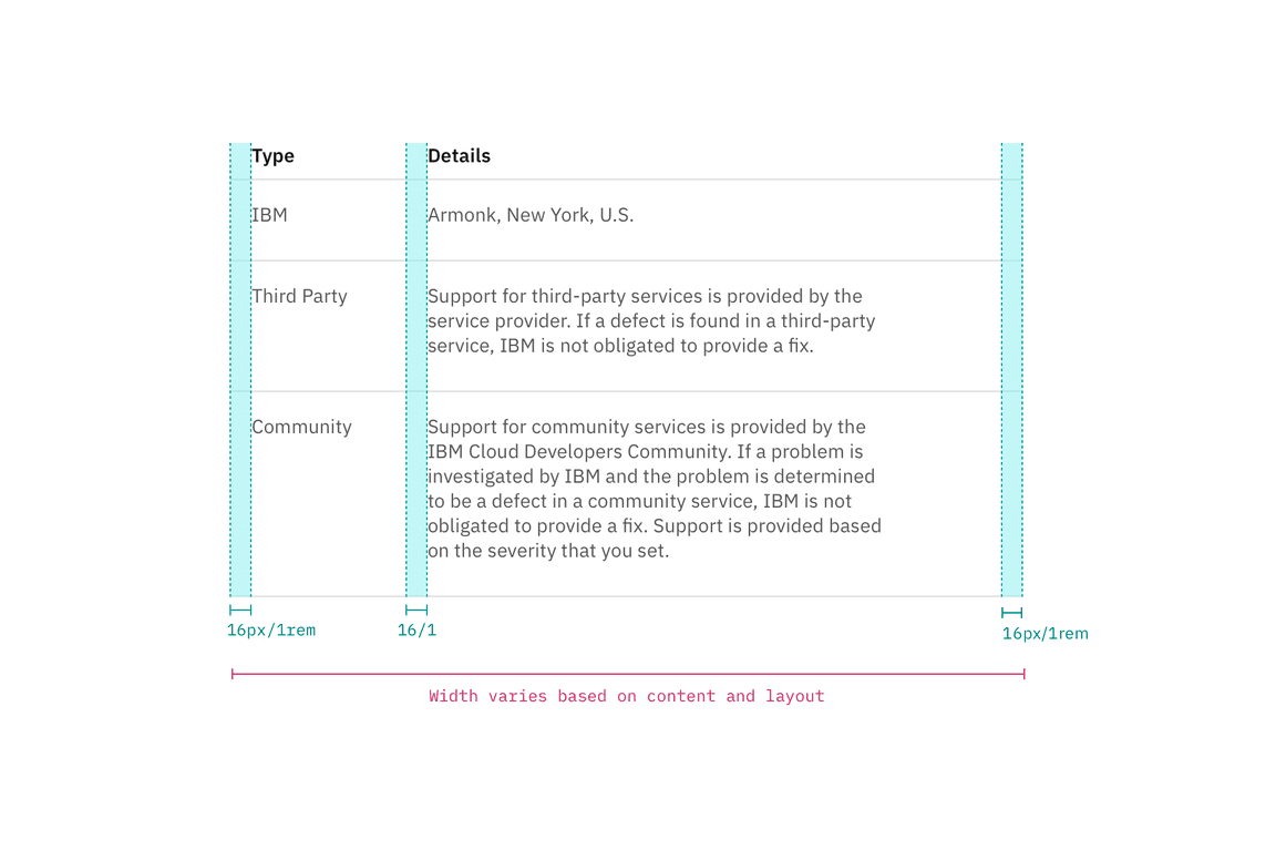
The width of structured list varies based on content and layout.

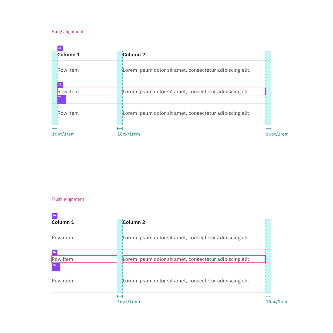
Spacing and measurements for default spacing with hang alignment and flush alignment| px / rem

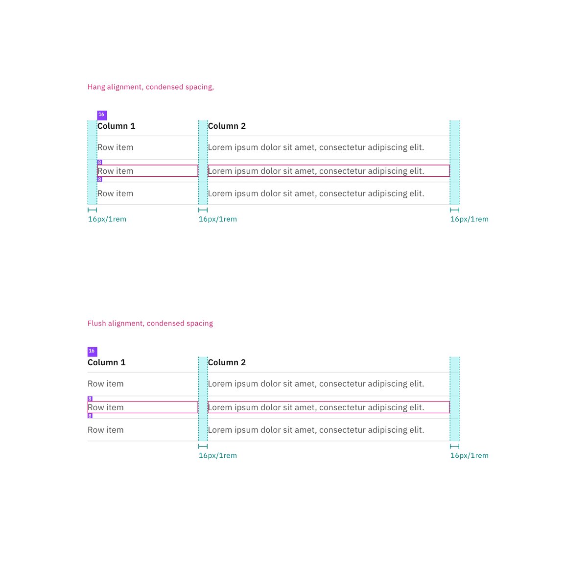
Spacing and measurements for condensed spacing with hang alignment and flush alignment | px / rem