Content switcher
Content switchers allow users to toggle between two or more content sections within the same space on screen.
Overview
Content switchers allow users to toggle between alternate views of similar or related content. Only one content section is shown at a time.
When to use
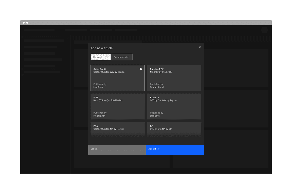
Content switchers are frequently used to let users toggle between different formatting, like with a grid view and a table view. They are also often used to narrow content groups. For example, use a content switcher if you have a single category, such as “E-mail” and you want to divide it into views such as “All”, “Read”, and “Unread”.
When not to use
Tabs
Use tabs when the content on the page is divided into related sections, but without any overlap. Tabs follow the metaphor for sections in a filing cabinet and two tabs wouldn’t contain the same sheet of paper. So the role of tabs in information hierarchy is to separate content.
Toggle
The content switcher is used for large groups of content, as opposed to the toggle which is meant for a “yes/no” or “on/off” binary decision.
Live demo
Formatting
Anatomy
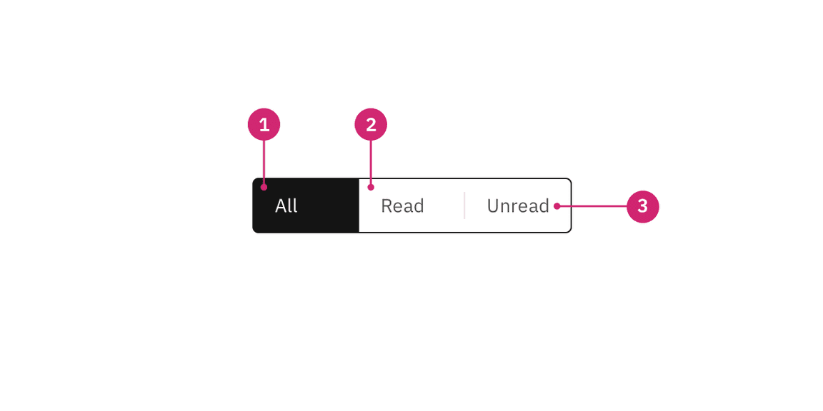
- Selected content tab: Only one content tab can be selected at a time and there should always be one selected.
- Content tab: Selectable container for each content view.
- Text label: Describes the content view.
Sizing
Height
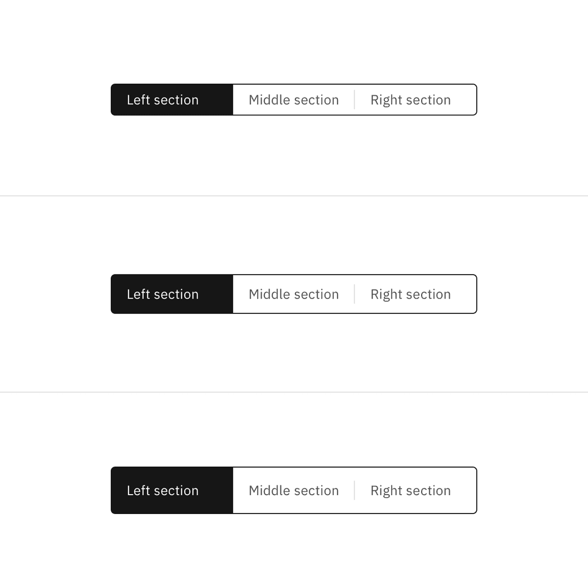
There are three height sizes for the content switcher: small (32px), default (40px), and large (48px). Choose a size that best fits the density of your layout or the prominence of the switcher.
Width
The overall content switcher width varies based on the content and layout. Each individual content tab should be the same width. The content tab with the longest text label should have 16px spacing to the right of the label. The width of all other tabs should match the widest tab.
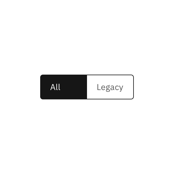
Do base content tab width on the longest text label.
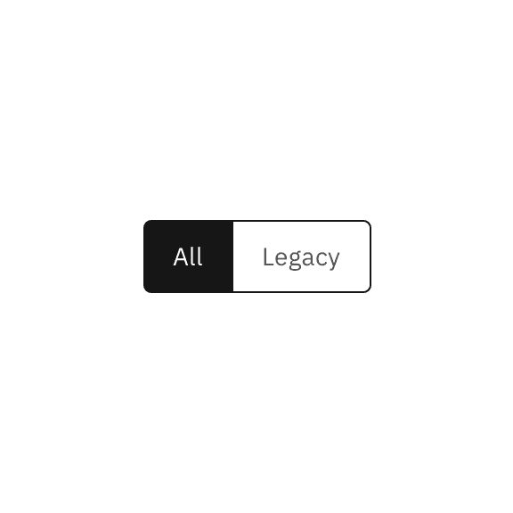
Do not use a different width for each content tab.
Content
Main elements
Text label
- Be concise and specific and limit text labels to two to three words.
- Text labels should clearly communicate the view users will see and the content contained in the view.
Further guidance
For further content guidance, see Carbon’s content guidelines.
Behaviors
Default selection
Only one content section can be shown at a time. The first content tab in the switcher should be determined based on usage and should always be the default selection.
States
The content switcher includes two content tab states: selected and unselected. The selected state uses a high contrast color.
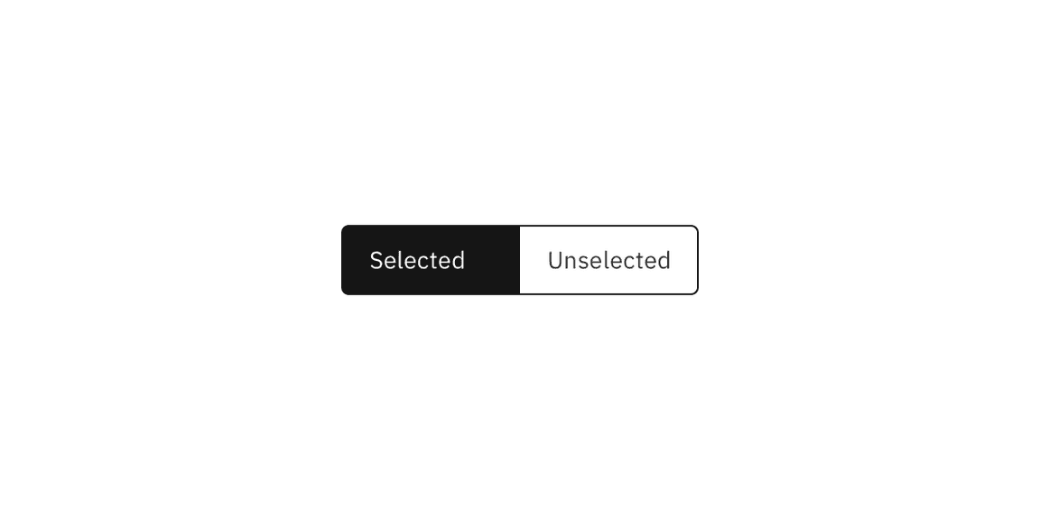
For detailed visual information about the various states for this component, see the Style tab.
Interactions
Mouse
Users can activate and navigate between content switcher tabs by clicking a content tab.
Keyboard
Users can activate and navigate between content switcher tabs by pressing the
left or right arrow.
Screen readers
VoiceOver: Users can activate and navigate between content switcher tabs by
pressing the left or right arrow.
Jaws: Users can activate and navigate between content switcher tabs by pressing
the left or right arrow.
NVDA: Users can activate and navigate between content switcher tabs by pressing
the left or right arrow.
Related
Feedback
Help us improve this component by providing feedback, asking questions, and leaving any other comments on GitHub.