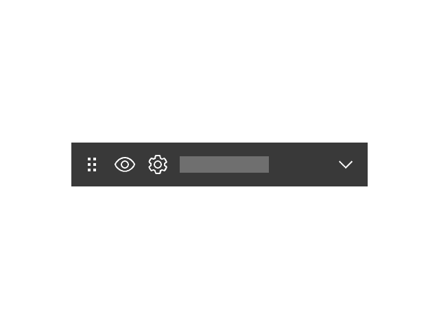
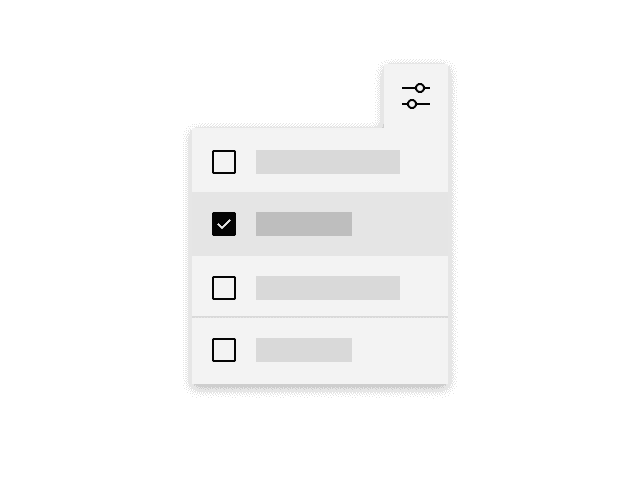
The action widget is used to provide a menu of available actions within a widget or application.
Component index
These components are developed and maintained by members of the IBM Carbon community and are currently only accessible to IBMers. They may change over time, and they may be incomplete or experimental. For support, please contact the contributors listed on each page.
Annotations are used to highlight important or insightful information within a large text passage.
CTA (call-to-action) section is used to communicate actions that users can take at key points in your narrative, such as at the bottom of an important section or page where the user is ready to progress to subsequent stages in the journey.
The Callout — quote is a typographic pattern that is used to highlight an impactful client statement or user testimonial.
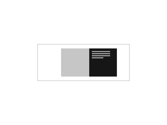
Callout — with media is used to feature a high value media asset such as a customer story.
Cards act as an entry point to a specific subject or user flow; they provide summaries of information pooled together and presented in a digestible way.
The Card is a clickable UI item that is used to present content in a concise and readable way.
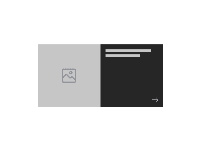
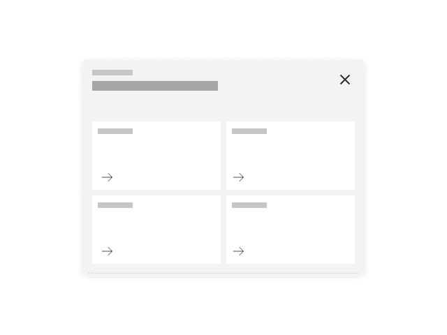
The Card link is a card that acts as a CTA (call-to-action), typically used at the end of a section of a page.
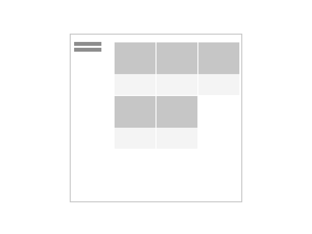
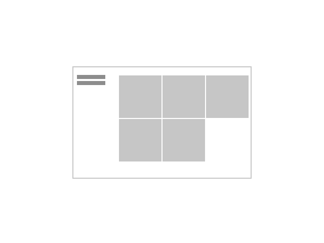
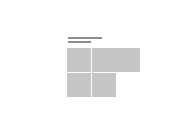
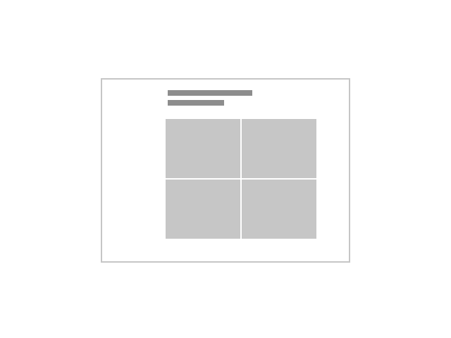
Card section — images is a collection of card components with images that, together, occupy a full-width section with a left-column header. This pattern is typically used for presenting resources or links.
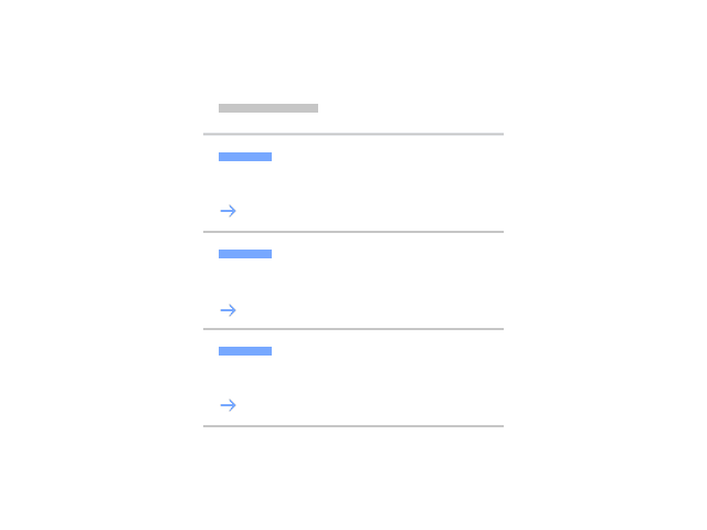
Card section — simple is a collection of text-based cards presented in a full-width section with a left-column header. This pattern is typically used for presenting resources or links.
A card is a flexible-sized container that groups related blocks of content and information into one understandable unit.
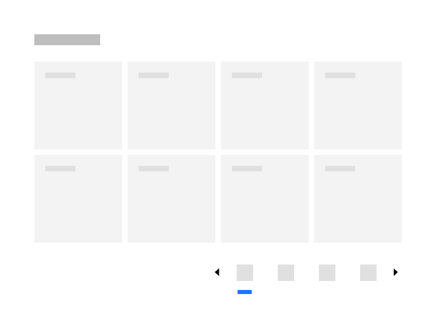
The catalog series of components work together to support the ‘catalog’ UX pattern (to come), with a series of tiles to display resources in a friendly, browsable way, as well as a wrapper to support and control the layout and features that can be used to support things like searching and filtering.
Content block – segmented is used for introducing page content, similar to Content block – simple but it has added ability to include subsections.
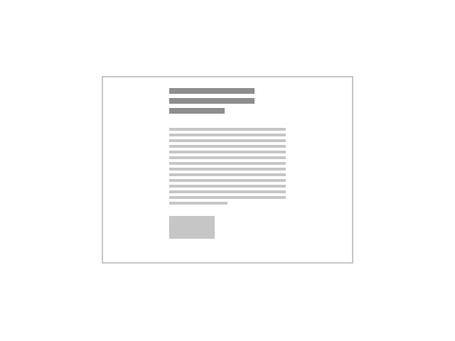
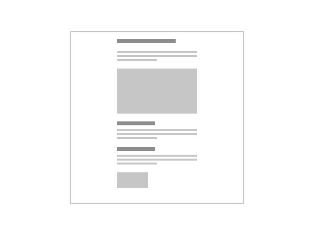
Content block — simple is typically used for the introductory section on a page.
Content block — with cards is used to present small self-contained pieces of information as cards. Use this when the cards are part of the main narrative, as opposed to secondary links or resources.
Content block — with media is used to present information with images in a group setting.
Content group — horizontal can be used to present important areas of interest relating to your topic, such as products or solutions.
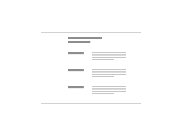
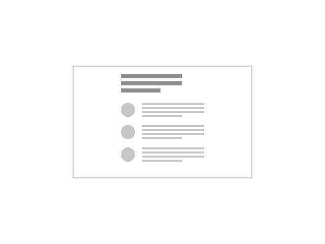
Content group — simple is an alternative form of a narrative pattern where the content is broken up into smaller pieces to make it more digestible.
Content group — with cards is used to present information through a group of cards with each acting as a call to action that drives to additional or supporting destinations.
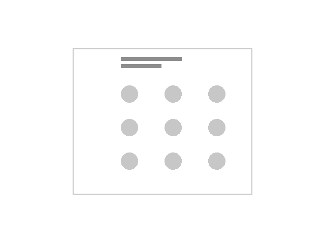
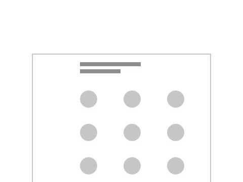
Content group — with pictograms is to present a group of information, each with a supporting pictogram.
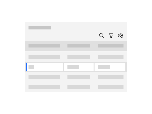
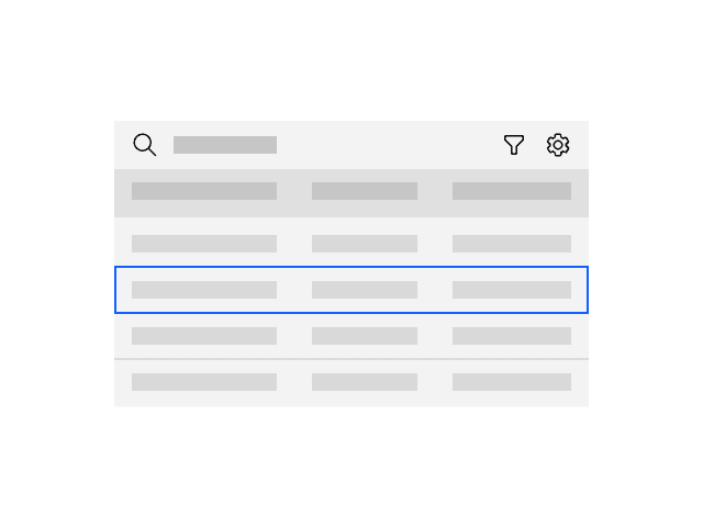
The data table provides a compact layout for viewing and managing large quantities of data while extending Carbon capabilities in a large number of areas.
EnhancedDataTable is meant to be used in place of the carbon DataTable. It is intended to make working with the DataTable much simpler and provide a more consistent experience.
ErrorBoundary is a component used to prevent JS code from crashing React. The component will catch any JS errors thrown from any React components rendered as children and show a generic error message in it’s place.
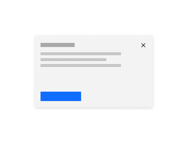
The Expressive modal uses the Carbon modal and only deviates to increase readability and usability within expressive moments.
The Feature card is used to emphasize a piece of information, indicate significant progression or highlight an important next step.
Feature card — block is used to present information with a group of cards. Feature card block — large is used to present main piece of content as a main feature.
Feature card — block is used to present information with a group of cards. Feature card block — medium is used to present a group of information with a medium size card with an image.
Uploading is transferring a resource from a local system to a remote system.
A sticky or fixed button bar should be used for certain forms. See the UX Patterns > Forms for design options and guidelines.
The footer is a section that sits at the bottom of any IBM.com page. It is required on all pages on IBM.com.
All products within the IBM Cloud Pak for Integration should use the recommended header. Exception is if a product requires a version of the header that needs to allow for customization by customers
The Horizontal rule can be used as a graphical element to add structure, introduce breaks in the content, or delineate pieces of information.
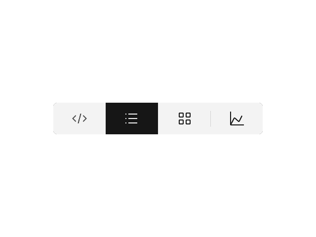
Within many IoT offerings a number of different ‘view’ formats are required to be close at hand to our users over an identical data set. For example; list vs map, or list vs tiles, or table vs chart.
The Image with caption is used to embed images and has an optional caption.
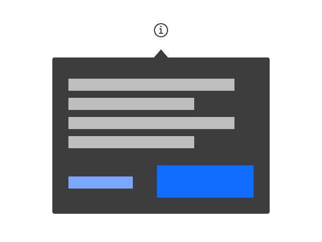
Use tooltips when a user needs to access additional text and/or functionality related to a specific element, without losing context.
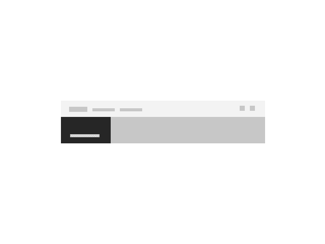
Level 2 nav, also known as L2 or World-level, is a navigation component that allows a user to explore the content and offering within a world.
The L3 nav, or resource level navigation component, is the suggested navigation for a resource details page.
Lead space is positioned at the top of a web page and serves as the first site of viewer engagement. Its primary purpose is to orient the user when they land on a page, inform them of the content, and guide them to the first key piece.
Lead space — block is an alternative to the Lead space. The Lead space — block can be used to engage visitors immediately in one of the most important moments in the user’s journey through a complex web environment.
The Lightbox media viewer allows the user to view an image or video at a larger size within a modal.
The Link list is used to present links as a group.
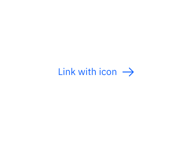
The Link with icon is primarily used as a navigational element with an icon as an indicator to the destination or type of content being referenced.
This high level component is dedicated to the population of lists by a user by selecting items from another predefined set of items.
The Locale modal allows users to change geographic regions and languages.
Logo grid is used to present a group of client or partner logos. This pattern is commonly used to establish credibility of the given product or service.
The masthead is a fundamental navigational component for IBM.com that displays consistently at the top of each page.
Menus act as an extension to the base set of capabilities that comes with traditional overflow menu options with the ability to contain a large range of content.
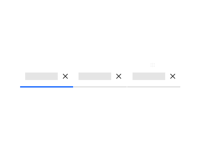
Modified tabs are used to quickly add or remove tabs. They allow users to view multiple pages of their product in one browser window.
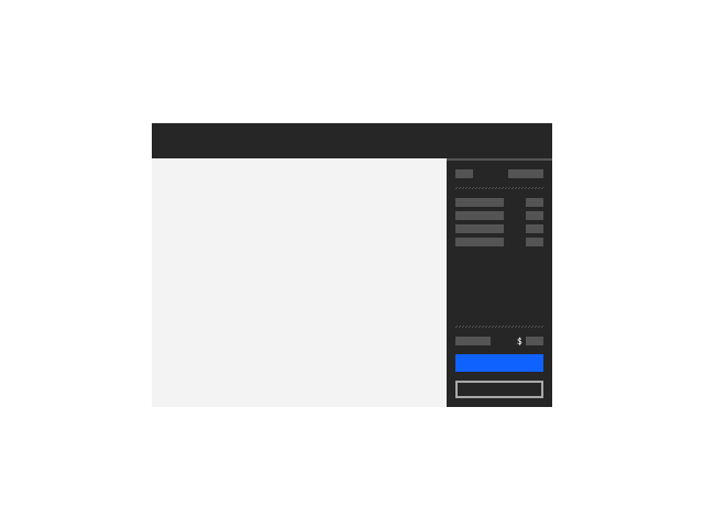
The order summary component summarizes the estimated financial costs and details of a service or offering on IBM Cloud.
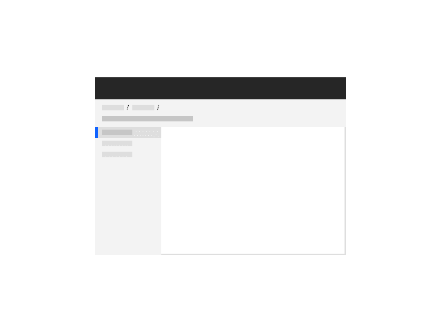
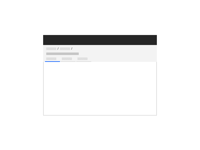
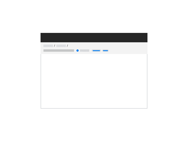
The page header allows consistency in the spacing and location of items inside page headers within a product and across products. This avoids users experiencing jarring movement and jumping of headers when navigating among product content.
All pages in IBM Cloud should have a page header. The purpose of a page header is to: provide context for the entire page and tell the user exactly where they are in the platform; act as wayfinding and/or navigation; and surface metadata or functionality that affects the entire experience below the header.
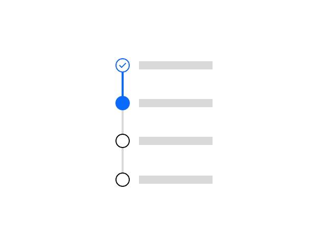
The progress indicator used within the IoT PAL is partially guidance based, but also provides some new capabilities in the form of sub-steps and responsive.
Required action modals are used when a user must select an action before moving forward. They cannot be dismissed without selecting an action.
Used to visually build rules from logical statements with AND and OR operators.
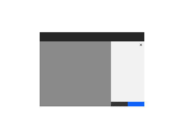
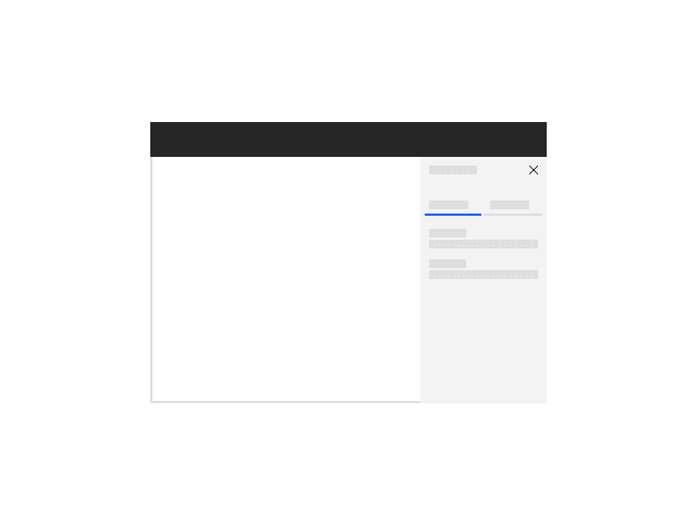
The side panel is used for keeping users in-context to a page while performing a task like editing, viewing details, or creating something new on a page.
Opens as the result of a user action. This component is an empty framework of which the content should be determined as required by products.
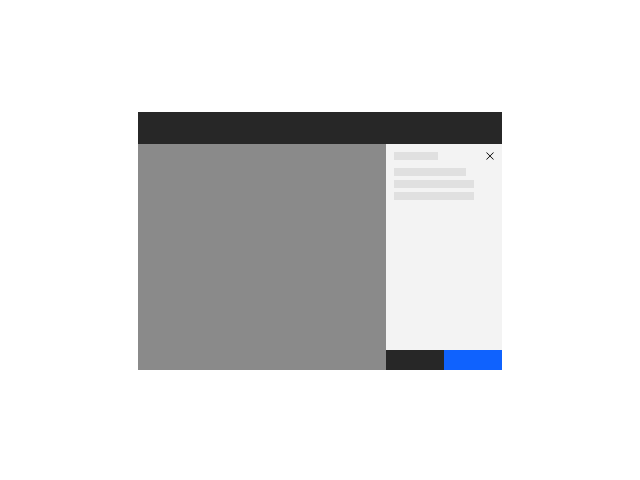
The slide over panel opens as the result of a user action and can be opened from anywhere in the product UI. It will overlay the main page content.
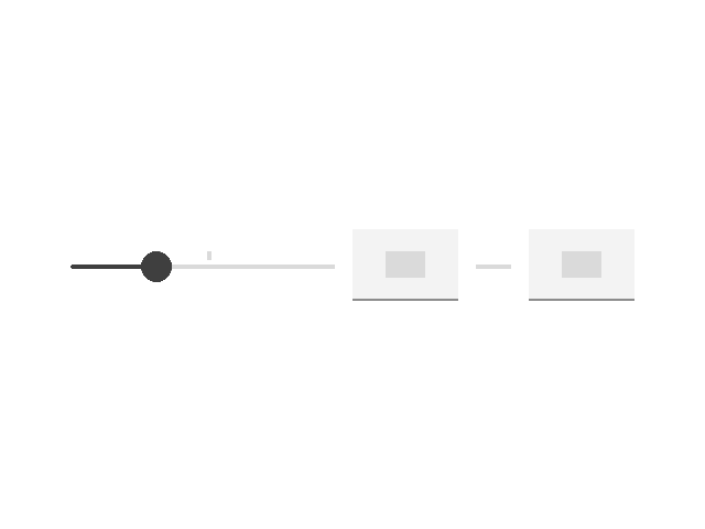
The user is able to increase and decrease two controls in order to specify a range of values.
The Table of contents allows users to quickly navigate through long pages by providing jump links to different sections of the content within a single page.
Use tags for items that need to be labeled, categorized, or organized using keywords that describe them. Tags can also be interactive, providing a substitute for elements such as links or buttons. (For single and multi select tags, please use the Selectable Item component.)
The Video player uses Kaltura video platform and is the standard way of using a video on pages and in components.
A dashboard widget provides a summary of a platform functionality, status, or individual service. The goal of a widget is to provide actionable information that helps the user quickly accomplish a key task or track key metrics.
